You can find this medium on our Spanish education portal .
Wie gefällt Ihnen unser aktuelles Medienangebot?
Welche Medientypen haben für Sie einen besonderen Mehrwert im Unterricht?
Wünschen Sie sich zusätzliche Funktionen auf dem Medienportal?
Mit der Teilnahme an dieser Umfrage können Sie mitgestalten, worauf der Fokus in Zukunft liegen soll.
Liebe Nutzerin, lieber Nutzer,
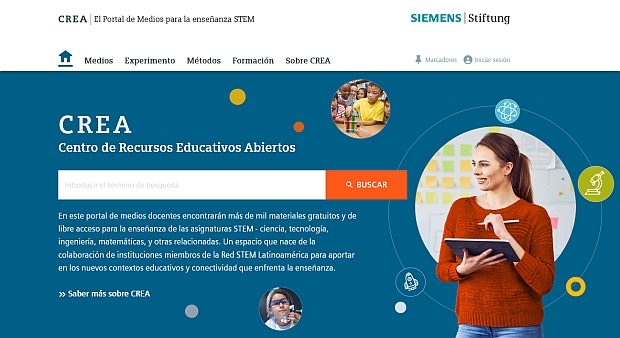
El Portal de Medios – das spanische Medienportal – ist umgezogen und heißt nun CREA.
Auf CREA finden Sie weiterhin hochwertige Medien für den MINT-Unterricht und vieles mehr.
Dear User,
El Portal de Medios - the Spanish Media Portal - has moved and is now called CREA.
On CREA, you will continue to find high-quality media for STEM education and much more.
Estimado usuario, estimada usuaria,
El Portal de Medios – en español – ha sido trasladado y ahora se llama CREA.
En CREA seguirá encontrando medios de alta calidad para la enseñanza de STEM, y mucho más.
Zu CREA wechseln / Switch to CREA / Cambiar a CREA
CREA - El Portal de Medios para la Enseñanza STEM
Hierbleiben / Stay here / Quédate aquí:
Fenster schließen / Close window / Cerrar ventana